
CERTIFICATE IN GLOBAL HEALTH RESEARCH
Course 16: Analyzing Data in Excel
There are a variety of methods that may be utilized to analyze data. Many statistical packages are available, including Microsoft Excel, which is free and can often be used for simple, efficient analysis.
Using the table below as an example, several methods of data analysis in Excel will be examined, including the sort function and the Pivot Table. The sort function is best used for relatively small databases, while the Pivot Table is helpful for analyzing larger datasets and quickly grouping items. Utilizing the sort function on the data set below, it is possible to count the number of people with allergies and determine how many of them are male or female. The data is sorted first by diagnosis and then by gender.
Data Analysis Example

Hints for Analyzing Data
Before using the sort function or Pivot Tables, the data must be “cleaned.” This means that the first step in data analysis is to go through the data and ensure that the style of data entry is consistent within columns. In this case, for diagnoses, it is important to make sure that only one word, phrase, or abbreviation is used to describe each diagnosis. If multiple words are used to describe the same thing— for example, if “allergy” is written in the database as “allerg,” “allergy,” and “allergies” — the analysis will be more difficult, so it is best to choose one term and use it consistently. It may be necessary to change the terminology used in the dataset in order to be consistent throughout; such changes ought to be made at this preliminary stage. If there are multiple diagnoses for a single subject, it is important to list the diagnoses separately. It may be necessary to create additional columns labeled “Diagnosis 2” and “Diagnosis 3,” listing one diagnosis in each column. (If this is the case, it is possible to create multiple Pivot Tables and manually add the results together.)
Using the Sort Function in Excel
Using Excel 2016 for Windows, first select the data (“Control-A” selects all). On the top of the Excel tool bar, choose the “Data” tab. Then, click the sort function (circled below in blue). In the window that pops up, click “Sort by ‘Diagnosis.’” To sort again by gender, click the button in the upper-left corner of the window that says “Add Level.” Then, click “Gender” and the “OK” button. (See picture below.)

Sorting is a great tool to identify trends and to analyze small amounts of data. In the example above, once the data are sorted by diagnosis and then by gender, simply count the number of people with each diagnosis and record the gender breakdown, either manually or using the Excel “COUNTIFS” formula. To use the formula to count the number of females with an allergy diagnosis, select an empty cell and type “=COUNTIFS” followed by the range and criteria. For this example, the first range is D2:D23 and the first criteria is “Allergy.” The second range is C2:C23 and the second criteria is “F.” See the picture below for the proper formulaic notation.

Press “Enter,” and the number of individuals who have an allergy diagnosis and are female is revealed in the cell.

This formula is an excellent way to count specific data if it is too time consuming to count manually. Simply alter the range and criteria in the formula to examine different subgroups.
Using Pivot Tables in Excel
With large data sets, manually counting or using a formula to count can be tedious and create opportunities for error. Pivot Tables will automatically sort data and list values, producing efficient and accurate information. To create a Pivot Table, select the data, click on the “Insert” tab, and then select “Pivot Table.” (For Macs, click on the “Data” tab, followed by “Pivot Table.”)

The Pivot Table will open in a new sheet of the Excel file. The next step is to add values. On the right side, there is a box that says “Choose fields to add to report.” To first sort by diagnosis, drag the “Diagnosis” label (the one with the checkbox next to it) into the “Rows” box. It will look like this:

To next determine how many people had each diagnosis, drag “Diagnosis” (the one with the checkbox next to it) to the box with the heading “Values.” It should look like this:

To sort by gender, drag “Gender” to the box with the heading “Rows,” and Excel provides an automatic breakdown, which can be used to calculate percentages and to create graphs.

Alternatively, to sort first by gender, and then by diagnosis, switch the order of “Gender” and “Diagnosis” in the “Rows” box.

This is just one example of how Pivot Tables can be used. Fields can be added or removed as necessary. It may be helpful to practice dragging different fields to different categories in order to develop an understanding of how Pivot Tables work.
Creating a Data Display
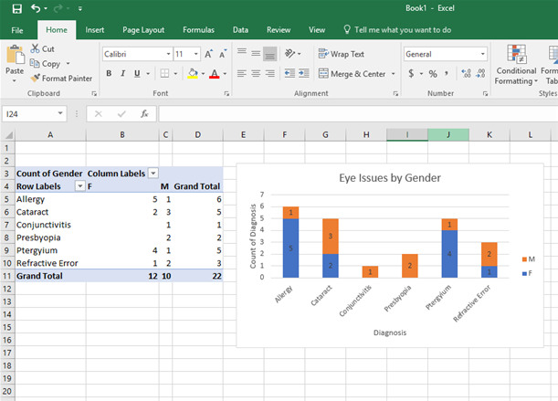
Once the data are analyzed, it is often useful to create a display so that others can quickly and easily understand the results. One way to do this is to create a chart using Excel. First, create another table to more easily show the breakdown of number of males and females with a certain diagnosis. Do this by dragging the “Gender” field from the “Rows” category to “Columns.”

Next, click “PivotChart” under the “Analyze” tab, and select the option “Stacked Column.” This shows the number of males and females with each diagnosis, stacked on top of each other.

After the chart has been created, click on the green plus sign in the upper right corner of the chart to add chart and axis titles, add data labels, format the color scheme, and hide the field settings.

Once the chart is customized, it clearly displays important trends in the data. For example, from this chart, one can quickly see that no females were diagnosed with conjunctivitis or presbyopia.
The Importance of Reporting All Results
When analyzing data, it is critical to report all results, even if they seem insignificant. It is also essential to not lump data analyses together and make generalizations. For example, a researcher conducting a study on the effectiveness of a visual aid to increase knowledge of cataracts administers a 10-question survey to patients before and after showing them the visual aid. The researcher finds that the visual aid increases the overall number of questions answered correctly. This is a good start, but it is not enough. It is critical that the researcher analyze the results of each individual question. Just knowing that the intervention increases overall knowledge provides little information about the strengths and weaknesses of the intervention. Perhaps the intervention caused a significant increase in the number of people understanding what a cataract is, but not the number of people understanding proper post-operative procedures. This is important to know because the intervention can then be modified to better convey the necessary information.